Spreads
Spreads
Spreads
Spreads
Spreads
It is critical to observe the movement of prices in Forex trading. There are several ways to accomplish this, including seeing the ticker in real-time. But the most popular method is to display prices on a chart, which enables you to observe how prices respond at crucial moments.
Traders use prominent chart types, including line charts, candlestick charts, and bar charts. Each chart type presents data uniquely and has distinct advantages.
Line charts are the most straightforward to understand, primarily because line charts only display closing prices. Thus, they eliminate “noise” generated by less crucial trading times of the day, such as the open, high, and low. Line charts typically depict a single line that connects all of the period’s closing values – the following is an example of how the XAUUSD daily line chart looks:
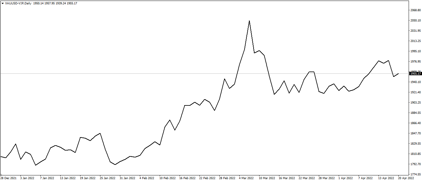
Since closing prices are often seen as the most relevant, it’s easy to see why investors and traders like line charts.
Line charts provide a concise, simplified snapshot of the current market condition and are typically the best choice for individuals seeking a fast glimpse of the market’s direction.
Bar charts, commonly called OHLC charts, depict four critical points: the Open, High, Low, and Close (OHLC) of a given period. Consider it an enhanced version of the line chart, as it reveals additional information that can be used to aid in trade research and uncover additional information about specific price moves.
For instance, if the space between the Open and Close bars is vast, it indicates that the price made a significant move during that bar. Combining a few of these might indicate a period of extreme volatility.
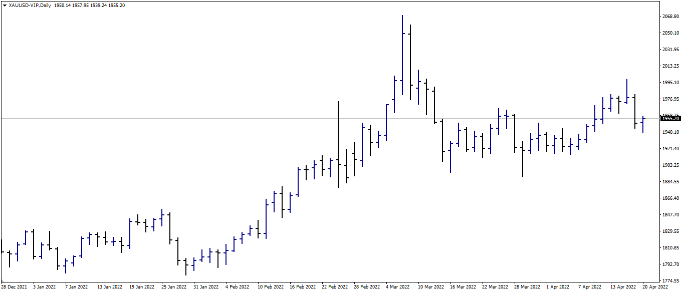
Not only can you see how prices are displayed in terms of bars in the same XAUUSD chart example above, but you can also see how there are periods of high and low volatility. This is very important in trading because it identifies periods and locations of high interest and indecision.
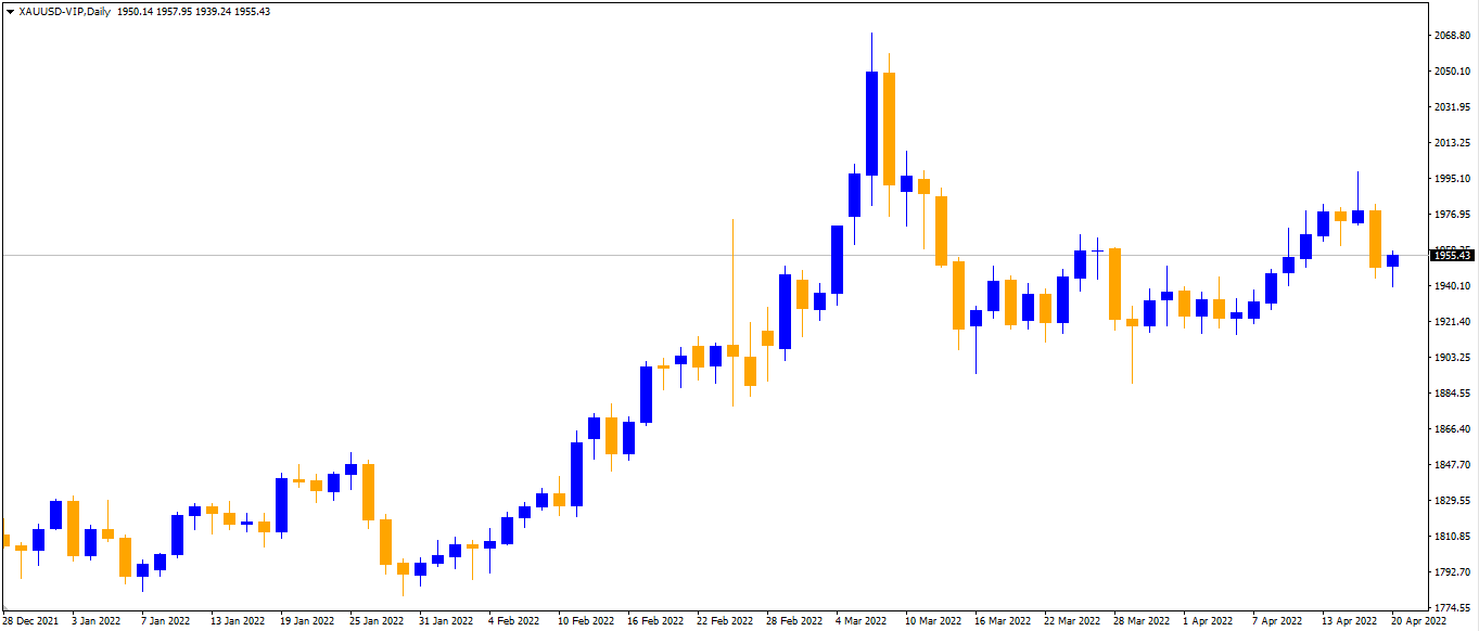
The candlestick chart is the most popular type of chart. Candlestick charts are composed of two distinct components: the body and the shadows (wick). The top and bottom of the body provide information about the opening and closing prices over the specified period. The shadows at the top and bottom indicate the highest and lowest prices reached within the specified period.
Candlestick charts, like bar charts, display the Open, High, Low, and Close in a different format. Indeed, many traders regard the candlestick chart as an enhanced version of the bar chart, as the additional information displayed allows for the creation of candlestick patterns (more on that later), which enables us to read the markets in ways that bar charts and line charts do not.
Typically, the candle body will be red if the closing price is less than the opening price. The body will be green if the closing price exceeds the opening price. In this scenario, red candlesticks indicate a price decline, while green candlesticks indicate a price increase.
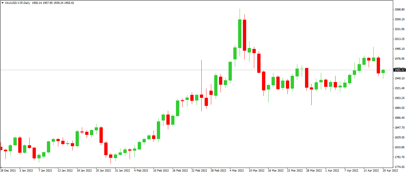
Using the same XAUUSD example, you can observe how prices seem different on a candlestick chart.
Important note: While red and green are typical colours for displaying falling and rising values, additional combinations such as black/white or blue/orange (like the sample below) may exist.
The most important thing is to know why they are formed so that the colours representing them can make it easier for us to figure out what they mean.